The Art of Color: How Harmony Shapes Eye-Pleasing Masterpieces
- karolinahybalska
- Aug 11, 2025
- 2 min read
Color theory is more than just picking pretty shades — it’s the science and art of understanding how colors interact, the feelings they evoke, and the principles that make certain combinations irresistibly appealing. Artists, designers, and even scientists have studied color for centuries, uncovering the rules that make our eyes and emotions respond positively to certain arrangements.
In its earliest form, color theory was explored by Isaac Newton in 1704 when he created the first color wheel. Later, Johann Wolfgang von Goethe (1810) and Albert Munsell (early 20th century) expanded this knowledge, blending optical science with human perception and emotion. Over time, artists have refined these principles into practical tools that guide them toward creating visually balanced and emotionally engaging works.
The Foundations of Color Theory
At its core, color theory defines relationships between:
Primary Colors – Red, Blue, Yellow (in traditional art); Red, Green, Blue (in digital displays).
Secondary & Tertiary Colors – Created by mixing primary colors.
Color Harmony Models – Analogous, complementary, split-complementary, triadic, and tetradic schemes.
Warm and Cool Colors – Affect mood and depth perception.
Value and Saturation – Determine lightness, darkness, and intensity.
Harmony is achieved when colors are arranged to feel balanced and unified, guiding the viewer’s eye naturally across the piece.

Historical Milestones in Color Harmony
Johannes Itten (1961) – The Art of Color: Defined seven key contrasts and emotional uses of color.
Goethe, J.W. (1810) – Theory of Colours: Focused on how humans emotionally perceive color.
Chevreul, M.E. (1839) – Studied color influence between adjacent hues.
Munsell, A.H. (1905) – Created a precise system for describing hue, value, and chroma.
Birren, F. (1969) – Linked color with psychology and mood.
Ou, L.-C. et al. (2004) – Quantified color-emotion relationships for single colors and combinations.
Palmer, S.E., Schloss, K.B. (2010) – Proposed that preferences link to emotional experiences with color-associated objects.
Kim, S., Suk, H.J. (2016) – Studied which contrasts maximize visual comfort.
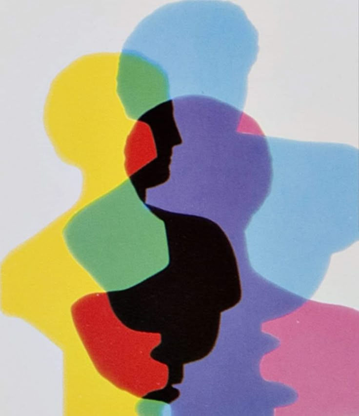
Why Harmony Matters in Aesthetics
A well-chosen color scheme is more than just visually pleasing — it can:
Evoke specific emotions (calm, excitement, warmth).
Create a sense of unity and balance in the composition.
Direct attention to focal points without overwhelming the viewer.
Make the piece more memorable and enjoyable to experience.
Poorly balanced colors can cause visual discomfort, confusion, or lack of engagement. In contrast, harmonious palettes create comfort and emotional connection, making art feel “right” to the viewer — even if they can’t explain why.
Understanding and applying color theory is not a limitation for creativity — it’s a tool that frees artists to express themselves while ensuring their work resonates on a deeper visual and emotional level. Whether painting, designing, or curating, harmony in color choices is one of the most powerful keys to creating art that pleases the eye and touches the heart.

Comments